Project Brief:
The project brief was to create a poster for the typographic celebration of everyday type.
Project Concept:
Celebrate The Beauty of Type
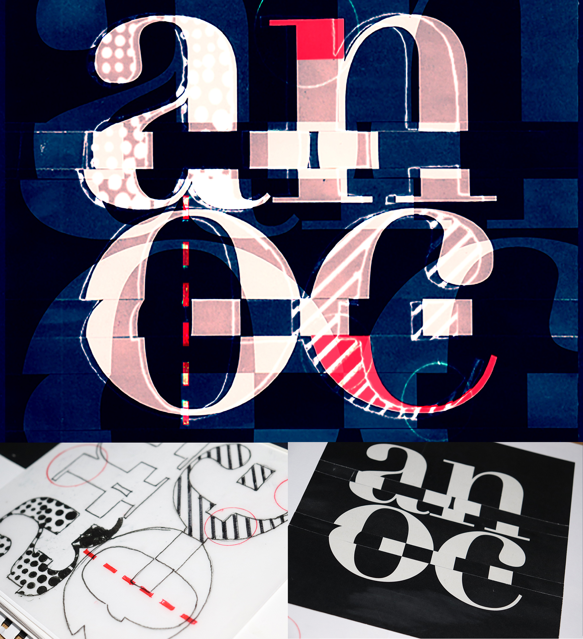
This project is inspired and represents the Didot typeface and its construction characteristics. The general assumption is the deconstruction of these classic types and the presentation of its characteristic beauty.
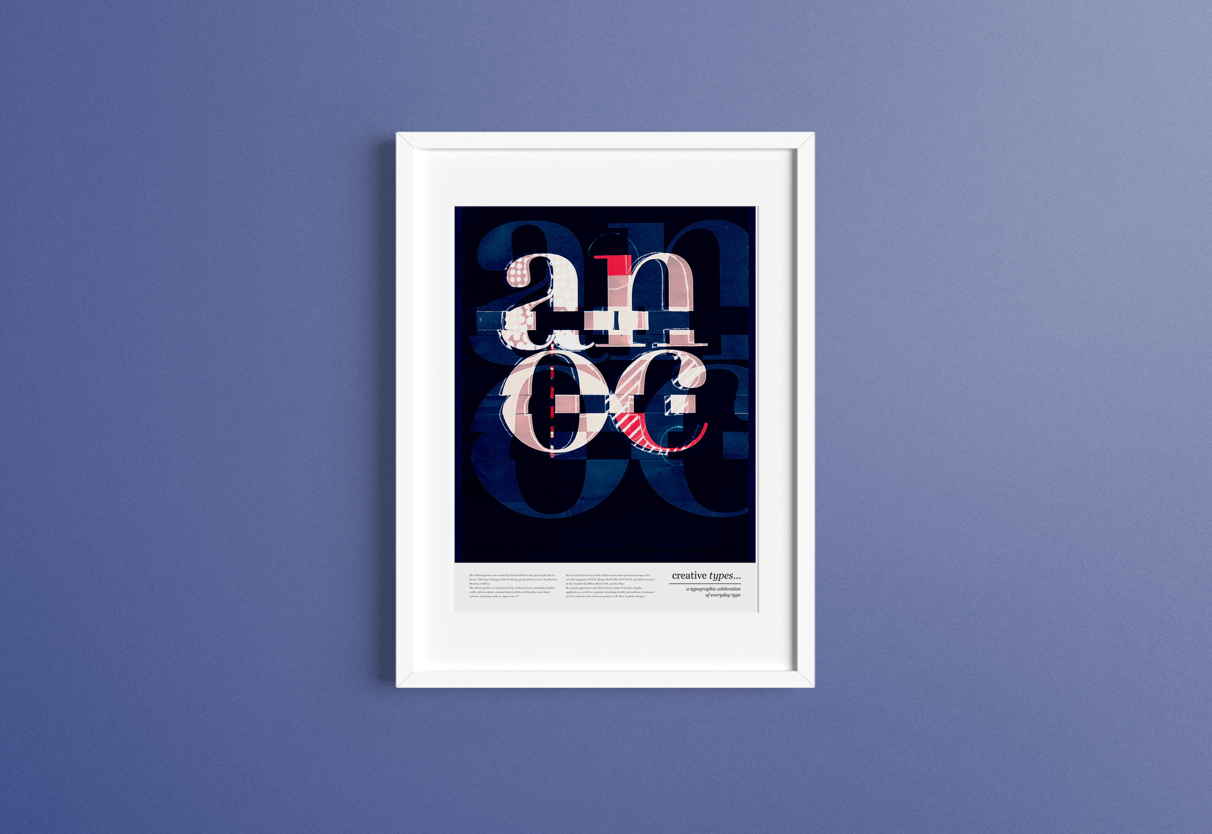
The Didot
The Didot typeface was created by Firmin Didot, in the period 1784-1811 in France. This type belongs to the Serif type group. However, it is classified as Modern or Didon. The Didot typeface is characterized, by vertical stresses, unbracket hairline serifs, extreme stroke contrast between thick and thin lines, and short extreme and sharp serifs on upper-case ‘S’.
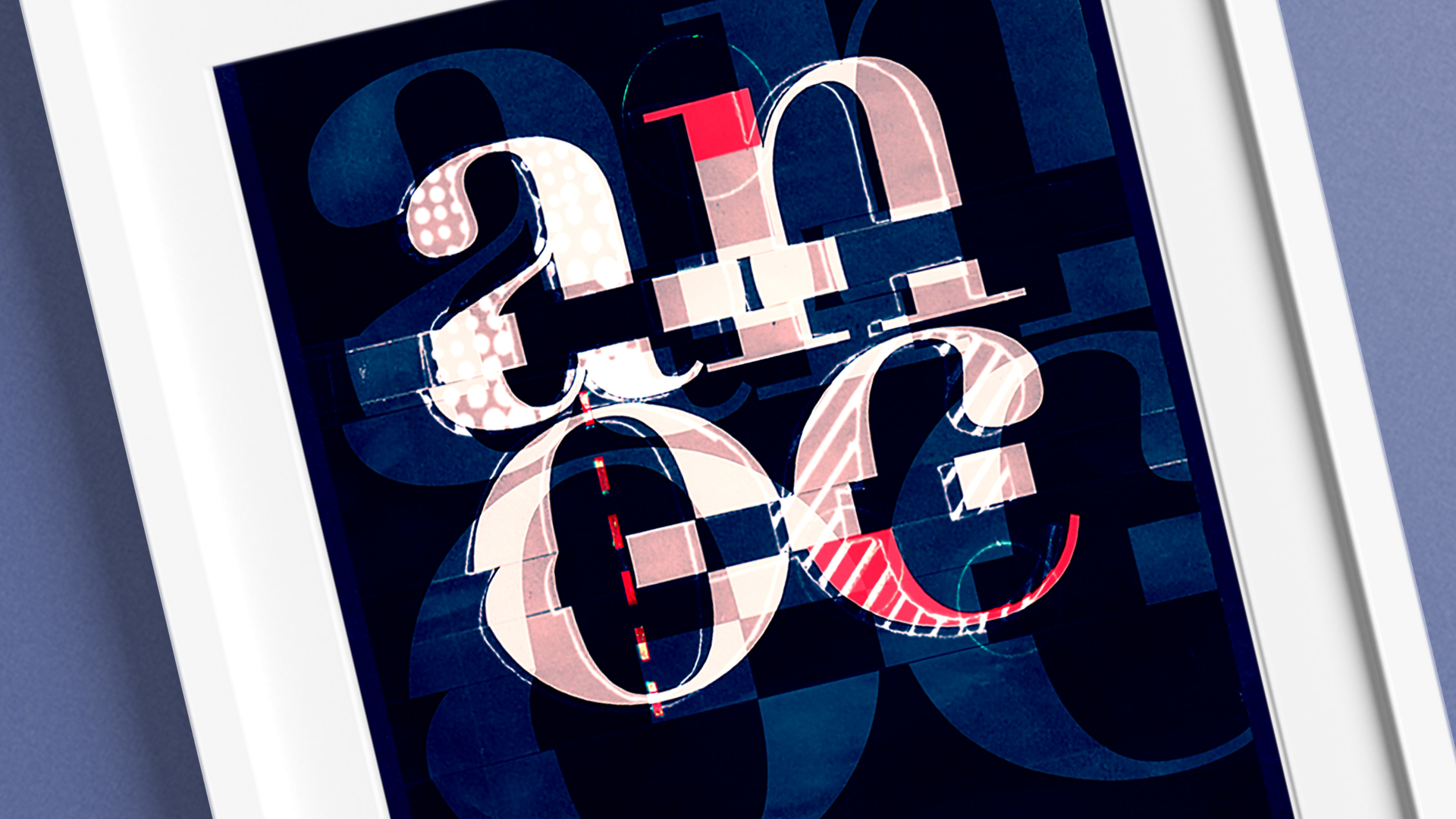
It is an ideal choice for beauty, fashion, and music product messages. It is used by magazines: ELLE, Harper BAZAAR, VOGUE, and also it is used by the brands CK, Hilton Hotel, YSL, and the Dior. Its elegant appearance and clear features make it ideal for display applications, as well as corporate, branding identity and software developers and it is valued as the reference point for all other ‘modern’ designs.